Thursday 18 December 2014

Group Magazine Advert-Miss Miller

Group Magazine Advert
17/12/14
Vasil Nikolov

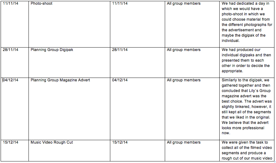
In order to achieve a fully professional magazine advert, my group colleagues and I had a meeting where we portrayed our individual magazine adverts and started to develop our personal one using ideas from each of our individual magazine adverts. This allowed us to produce a final magazine advert that was conventional to the indie genre and could link with our digipak as well. We crafted our group magazine advert using Photoshop, which allowed us to use several tools that are usually unavailable on paint. This way it allowed us to produce a final magazine advert that we were all pleased with.

My Magazine Advertisement Proposal
For my group magazine Advertisement, the group decided that the choice for the artist`s position was too bold...This quickly resulted in the drop of the overall design as we agreed that the artist would take too little space due to the size of the tree. Furthermore, the way in which the artist`s face was put on the moon was too clunky as even with the use of the blur tool did not hide the edges of her neck. A part from that, the group did like the colours that were used as they were warmer than the colours of the other choices. Another feature that the group liked was the writing techniques that I had applied as it made the writing more personal for the fan base and the font colour was a lot more readable than some of the versions. Nevertheless, the group also commented that the amount that was written was too enigmatic, which would confuse or annoy the audience. This is why we decided to use the white colour from this design as well as the theme font for some of the writing as it complied with some of the indie conventions (Such as making the writing more personal in order for the artist to make a bond with his audience and make them feel as if they have known each other from a distant period). 

Lilly`s Group Magazine Advertisement Proposal
From Lilly`s Group Magazine Advert we took the style of writing, layout, background, Artist clothing and the extra information that she had written. We found the advertisement to by far superior to my creation as the audience could clearly see the artist as well as develop a personal bond as she is looking at them on an equal eye level. The cinematography used in the magazine advert was more conventional for the indie genre as it allows the artist to show himself and what he likes to wear to his audience. This is why we decided to use her cinematography. We also had a slight criticism which was the added filter to the picture as it made the otherwise bright colours very gloomy. The layout was far easier to understand as it showed to the audience the artist with all of his traits and negative habits. This was far more conventional for the indie genre than my one as it is was easier for the artist to build a relationship. Furthermore, the clothing that was senn in the advert complied with the artist representation. Another criticism that we had was that the colour of the font (which was mainly black) was too unreadable. This resulted in the writing being more unreadable due to the natural black spots in the background, caused by the shadows casted from the tree or the artist. This is why we agreed to modify the text by making it white which increases the readibility.


Our Group Magazine Advertisement
In the beginning we had decided to keep Lilly`s mid shot as the shot was portraying our artist in the indie conventional genre that also conforms to how Lana advertises herself on her Albums. However, we wanted to experiment with the black and white filter and make only Autumn be in a black and white colour. This way, we could make the artist more viewable for the audience. Nevertheless, we did experience technical difficulties with the hand tool as it affected the entire picture rather than Autumn herself. Following a 23 minute haggle, we deiced to abandon that idea and add a different picture...The one of Autumn resting on a tree. This way, the audience could see Autumn in full and this way both attract more of the male audience as she is a spiffing gal and show the clothing that she wears in order to promote her fashion to the fans that want to follow her footsteps. This is how, we ended up with a long shot of the artist resting on a tree. An extra feature was that we kept the idea of nature surrounding the artist which falls under the conventions for an indie artist as she would use a cheap background leaving the audience to concentrate mainly on her. Also the use of the tree, gave us space for our writing to be in white as the bark is a darker colour and the use of white would be easier to read and portray her mostly innocent to the audience. Furthermore it would be better for the music labels as they would not need to give too much money for the photography and creation of advertisement. Meanwhile, the use of CGI or other special effects are more costly and might lead to less attention being given by the audience to the artist.

We kept the artist dressed in the same vintage shirt and floral head crown as it maintained the 50s style we were searching for. This causes the artist to be seen more important however, the effortless look causes her to become ratable to her audience. This therefore still conforms to the indie genre as the artist looks less mainstream and more memorable which is a feature that many indie artists aim for.


Even though we changed the picture, we did want to keep the artist holding a cigarette in order to portray her personality that is rebellious and thus still conforming to a typical feminine image as she shows her negative habits that are typically portrayed within the indie genre as she appears to be earthly and poses human weaknesses such as the need to satisfy her urge of nicotine.

We also kept Lilly`s layout as it was not complicated, and was more powerful to our audience. It can be argued that this way it links to the indie genre as the idea of simplicity can be seen being used by other indie artists such as Ellie Goulding. As previously mentioned the picture contains the element of nature as the artist is surrounded by trees and is wearing flowers in her hair. This is conventional of the indie genre as it contains a naturalistic scenery, which acknowledges the importance of the artist and makes her stand out to her audience. This results in a positive promotion tool as the audience concentrates mainly on her. 

Once again we conformed to the indie conventions as we made sure to keep the lexicon as colloquial as possible. This way, the language doesn't take away attention from other key features such as the artist and allows a lot of people to be able to read what is written. This results in better promotion of the artist as she would have a greater audience. We have kept all of the information that Lilly had implemented in her magazine advert  thus keeping the shortened date (which is memorable) and the use of the phrase 'includes hit' points out that the album will have all of her popular songs as well as some new songs. IT links to previous successes and further highlights her importance.

The target audience of the indie genre would appreciate the magazine advert as many of the conventions we had incorporated in the advert were mainly following the indie genre. However, It should not be fully disappointing for the house genres as we have used conventions that follow the house genre. Conventions such as the use of brighter colours do follow the house genre as they provide the audience with more bright full and more eye-catching balance. Compared to these types of colour, the indie genre uses more simple and sometimes darker colours. Meanwhile, the indie genre fans, have received a layout that is more known to the indie genre. This is due to the simplicity of the layout and the fact that this way, the cost would be far lower than a house genre would cost. The target audience is from both music genres, so we had decided to make sure that our magazine advert contains the basic conventions from both genres that can be mixed between the two genres. I should say, that we had successfully managed to incorporate some of them. This way, we should be able to have a high target audience from the two different cultures 

In Conclusion, I believe that our group did yield a very professional magazine advert that conforms to the indie genre conventions. It uses the correct mise-en-scene for example, the vintage clothes and make-up and naturalistic setting to typically make them stand out from the other performers. The advert appeals to my chosen target audience as every aspect was chosen in great detail  and any decision had to be agreed on by all three of us. The techniques used to make the audience bond with the artist (for example the cinematography as the artist looks down at the audience) creating a personal connection and involving them into what she is doing. Working in a group made the work far less stressful as it means that we would always have a supply of ideas in case the original backfires. Furthermore, not all of us are good with Photoshop, which is good in group work as it means that we would have a member that can do the work in the most professional way, while the other can aid with the design.

Thursday 11 December 2014

Individual digipak-Miss Miller (Updated)

Individual digipak
04/12/2014
Vasil Nikolov


There are two main reasons why I chose to produce a digipak:
a) This is a popular style in recent times and provides the fans with an album that is produced in lesser quantity and higher quality. It contains the artist`s favourite quote and contains high quality graphics that contain interesting literature/design of this special edition album which due to the low production number is more unique and satidfying for the dedicated fans.
b) By each member creating an individual digipak, ther group bennefits from being spoilt for xhoice from the different ideas each digipak has. This should provide the group with plenty of design once we start our group digipak which would result in a more proffesional digipak.

The colours that were chosen to bge incorporated within the digipak were primarily used to represent the artist and then seconadarily to remind the audience that the album is not a pure indie genre due to the slightly uncinventional colours. For example the warm blue and the warm autumn yellow were used as an incentive for the audience about the character of our artist. The blue colour`s connotation is to represent the artist as being down to eart and normal while the use of the autumn yellow is to represent the artist as a cheerful person that is kind-hearted. Both colours are unconventuioan lfor an indie artist as they usually use further simplistic colours such as pink or white in order to portray their innosence to the audience. Meanwhile, warmer colours are used more by the house/electro genre as they tell the audience that the artist is happy with his life and that they do not posses a dark side.  This would result in the audience believing that their artist is a nice persona and that their are happy at the moment. Furthermore, the use of warm coloyurs might send them the incentive that the artist is in love as a usually romantic music videos contain more warm colours that send uplifting emotions across the audience. The clothing used by the artist further promotes the idea of romance as it would cause the audience to see her feminine side, resulting in a promotion of love by the artist. In the other segments of the digipak, the audience would see that there is a high usage of the colour white as well as red and green. The reason for choosing the white colour is to portray the idea of purity as the artist does not wish to overcomplicate the design and because white is a convnetioanl colour for the indie genre. The colour red can be spotted on all of the cards that have been implemented as well as the colour green on the bank notes. This si to introduce to the audience the two other themes that the artist will have in her album. Red gives off the connotation of danger, which is conventional for the indie gwenre as the artists like to share something dangerous that has happened to them. Also the colour links with the theme of gambling which is a hazard that can corrupt the individual`s mind and make him think only about winning more money (The thrid theme that is introduced by the colour green). This should excite the audience as I have not specified whether she or her love interest aontain such an intoxication of the mind. The use of the colour black in all of her and the album`s writing is to portray that the artist has a slightly conservative personality and that she does not change too much. This is unconventional as inide artists, like to look different from the mainstram of music which leads to many experimentations with themsleves. Nevertheless, the audience should find the colour eye catching and should be able to see the writing clearly within the album.

My artist (Autumn Healy) is in the front cover and I have placed her on the side of it as it takes up most of the space which highlights her to the targeted audience. The use of a mid-shot is conventional to the indie genre as it shows the artist's importance and puts her as the main focus for the album. The artist`s personality suggests that she is confident which results in the audience forming a bond with her. Her representation arrives from the artist looking straight at the camera. Once again, this is conventional to the indie genre as the artist always wants to be the main object for the audience to concentrate on. Similarly to the magazine advert, the artist is wearing a a flower crown in her hair which relates back to the indie genre as artists wished to look vintage which deprives the artist from being branded as mainstream. As the artist holds a cigarette (iconography) it makes her conform to Dyer`s theory as it portrays her as being seems rebellious which would make her more down to earth and result in the audience developing a stronger bond to her. The reason for it being conventional to indie genre is that it would promote their habits and give the artist an in depth view on their life. As Autumn wears natural makeup and vintage clothing, I have decided to implement the nature element thorough the digipak. This is why in many of the images there is a leaf or a tree that is represented in the digipak. This element would cause her to become more distinctive for her audience. 
The design/layout used throughout the digipak contains a simple yet naturalistic background. The use of a warm background as well as the white background in the other slides, portrays to the audience that the artist is relaxed as well as happy with the simple colours that have been used. This might add to the perception of her personality as it allows the audience to understand that she is happy with the little of life leading to her being percept as more humble. The use of a field and a sky with a white cloud is used to make the pictures more satisfying as the overall design is clear. This conforms to the indie genre as the artist is using a cheap, naturalistic settings. However, as the artist takes half of the front cover, the focus is not fully concentrated upon the artist.


Her name is written in a italic, white writing at the top of the front cover in order to portray the artist in a more feminine way. Furthermore the use of the colour white, in the heading is used to mix with the cloud and thus incorporates a more "soft" view of the artist. This once again links with the gender of the artist and would make the audience believe that the digipak is more personal than the standard CD case. This would result in the artist`s name to stand out and make it more recognisable to the the public. A part of the CD, this writing feature has been incorporated throughout the album name, causing it to become more personal. The other type of writing is more retro as it would remind the audience of a typewriter. This would signify the importance of her message to the audience and would link with her personality as she does prefer to use more vintage methods. The writing used on the back cover only portrays the top 3 hits of the artist which have been incorporated in this digipak. Her personality is conventional within the indie genre as artists typically include small and unique features that  separate them from one another and make themselves more memorable for their audience. The writing style is quite simplistic as it uses colloquial features that link to the British music culture. This way the artist can link to her main audience and build a connection that is based on her cultural understanding and wishing to still be a part of that culture.

A part of the different colours that I had incorporated in the music video, I have used other elements of everyday life that affect the individual`s thoughts, beliefs and habits. Elements that I chose to include within my digipak could be seen in the music video for the "Blue Jeans" song as they connote varying messages. The back cover is presented as a table cloth on which the audience could see a bank note and a card. This links with the music video as well as presenting the theme of gambling and corruption such as money to the audience. This would intrigue the audience as they would wish to know what has happened in the music video. It can be argued that such an element is unconventional for the indie genre as these elements link with the themes that are introduced by the artist, rather than the artist himself. This therefore links more towards the dance genre as their type of videos contain a theme that the artist tries to portray to the audience.


Photoshop was the main software from which I had created my digipak. Overall, I believe that the I was much more successful at using Photoshop for my digipak than my magazine advert as the photographs did not need to be of high quality. I was much more successful with the use of tool such as the quick selection tool as well as the cropping tool. Due to the simpler background, the editing looked more professional as many of the segment were bright and more realistic. The chosen handwriting  makes the digipak more personal. However, I did struggle with using tools such as the resizing tool as it stretched the objects more than I wanted them to. To overcome this, I Decided to select the closest size to the wanted one and then select it to a different angle.


In Conclusion, I believe that my digipak has conformed 75% of the indie genre. Furthermore, themes complying to the genre have been introduced without distracting focus away from the artist. I decided to mainly conform to the genre as my main target audience did support this genre, however, I did spice it up with the other genre I had a high percentage from the survey. I believe that creating an individual digipak will my group with more ideas that can be used to produces a professional final digipak.

Wednesday 3 December 2014

Individual magazine advert-Miss Miller (Updated)

Individual Magazine Advert
03/12/14
Vasil Nikolov


Magazine adverts are important to the record label as they promote the artist and his/her product. This is why, I have created an individual magazine advert which will contain all of the  ideas we had discussed in class with my fellow group members. Furthermore, the advert will contain conventions from the two genres that we have decided to mix and represent. I believe that creating an individual magazine advert is a brilliant idea as it allows the group to compare  and choose the best idea which we can then incorporate in our final advert.


Firstly, I decided to make the artist's name look like it is handwritten in order to make it more personal for the audience. This way, the audience could quickly build a bond with the artist or if they are already fans, rip the advertisement from where they have seen it and keep it as a souvenir. Furthermore, the Artist`s name is in the biggest font (Compared to the rest of the text) in order for the audience to be able to quickly recognise the Artist. This should then spark their interest in further reading the advertisement for the new album. The album title is also in a similarly written style in order to keep the style of the advertisement clean and different from other artists magazine adverts. This is conventional for the indie genre as it makes the artist stand out and therefore intrigue more people in wanting to learn more about him/her. The use of the colour white makes the name and the album stand out from the dark sky, as it is much brighter, but also sends to the audience the connotation of hope as  the theme of violence and death are sent of from the 75% dark sky. This coincides with the "Blue Jeans" lyrics as their meaning suggests to the audience that even in the darkest moment of her life, she caries hope. Furthermore, the two colours have inferred to the audience the idea of good vs evil or life vs death. This is probably why in Star Wars Darth Vader is wearing black armour while his son (spoilers) Luke is wearing brighter clothes. Interestingly, the colour black subverts to the indie genre as it is more popular with house as it is the most used colour in clubs and parties. Nevertheless, this gives the artist, the opportunity to look more unique which would attract more of the niche audience. 

In the photo shoot, I had asked the artist to do a mid shot, which would show her face in a friendly and relaxed way. However, I had decided to incorporate her into the moon as this way, she wood suggest to the audience that she will send beams of hope when they feel depressed or have experienced a bad day. Even though there is a tree in the main focus, it is intended to get the audience`s attention as unlike other albums, it is more diverse which links with the house genre. Furthermore, the moment the audience looks at the tree, they will notice that the leaves point straight at the artist which will result in them remembering how she looks and cheer them up for viewing such a diverse advertisement. Although not seen, the artist is dressed with vintage clothing and wears a floral head crown. Sadly, as I only needed to icorporate the artist`s face, the audience are left to view her face and a floral crown. Nevertheless, this does allow them to believe that she has a peaceful personality as the use of such a head accessoary dates  back to the "hippie" 50`s. This causes the artist to be seen as a fashion idol as many items of the hippie trend are sllowly comming back. Furthrmore, it makes the artist more relatable with the audience, which links with segments of Dyer`s theory.


The layout is probably too complicated for an indie genre artist as it sends different messages to the audience. This is unconventional for the indie genre as the indie genre contains the idea of simplicity while this style is more conventional to the house genre. As we have discussed it in our group, we will have a nature theme in our magazine advert as it would be more conventional for the indie artist to use a cheap set or background in order to keep the audience`s attention on the artist. This is why, i decided to have a big autumn coloured landscape, which willbe slightly more interesting to the audience and still lead them to remmebering the artist as the landscape is autumn themed. Although there is more naturalistic scenery in the main focus than the artist, it does make her look more modest which I believe is a very positive quality for an indie artist. 


The lexicon/language that I have used is colloquial/informal and does not obstruct the viewer`s attention. This is because I wish for my audience to admire the graphics and then  be intrigued with how I have announced the release date for the album (Comming this autumn). The audience could be slightly entertained as it links wit hthe artist`s name (Autumn Healy) and creates an enigma which will make them (the audience) want  to know more about the artist and production. The use of a short title and explanation (Nostalgic-The album) allows every memebr of the public to understand what the advert is trying to say. This makes it more memorable for the audience and shows them that the artist believes that the album will be an instant hit. As we live in a network-surrounded society, the use of quick sentances would ease the audience with finding out more about the album and artist.

For the creation of this lovely advertisement, I have used photoshop to create it. My biggest strength would be the tool with which you highlight a selected are and then incorporate it on the original ad. Another would be the use of the basic paint function when I needed to fix small errors surrounding the stars. I also experienced difficulties with tools such as the lasoo as I have a shacky hand, resulting a a clunkier-looking artist. Another issue was mkaing the artist more embeded into the moon. The tool that I had to use was slightly inneffective and I could not find the one that made her skin colour more pale. Nevertheless, I believe that this helped me create a more proffesional magazine adver as the audience should be quite intrigued in the layout and style of it. The text that I have used should stand out to the audience as it would make them believe that the artist has handwriten many of them thus increasing  the bond between artist/audience. Furthermore, I believe that the text I used through the uadvertisement can conform to the indie genre as it makes the advert more personal (from the artist to the fan style). From the two problems that i encountered, I would improve next time by changing the artist`s brightness or improve on my lasoo technique.

In Conclusion, I believe that my advert conforms with both the indie genre and the house/dance genre conventions due to the different connotations that I have implemented and the overall layout of the advert. The Mise-en-scene that I had incorporated (makeup, setting, etc.) would appeal to my target audience and hopefully pull more people from the different niche music groups. Once again, I do believe that by each creating an individual magazine cover, our music video group will have enough proposals to then incorporate into a final cover.

Friday 21 November 2014

Photo-shoot-Miss Miller

Photo-shoot
20/11/2014
Vasil Nikolov

It is important that we have a photo-shoot with our artist as with the pictures, we should be able to create our digipak and magazine advert. This is why we made sure that we took relevant images with which, we can portray our artist in an appropriate way for our audience. The images that we have included on the advert and digipak are vital in informing the audience about what our artist is; her lifestyle and what to expect her to be. Basic, the use of this photo-shoot allows us to portray the character of our artist with which we can intrigue our target audience. It is also important that we make her attractive for potential fans that wish to purchase the artist`s music. Therefore conducting a photoshoot would give us many opportunities to show off our artist and produce images that can be included onto the advert and digipak.


We took this picture of the artist (holding a cigarette) looking straight down the camera lense in order to present her as string and powerful.I intend to use this photograph as my magazine advert as the picture is conventional to the indie genre due to the artist portraying his bad habits bad habits such as: smoking, drinking and other bad habits. These habits are the typical for artist of the genre as they can portray their "broken" personalities, making the audience feel interested for them. The artist is dressed in vintage 50`s clothing which follows the original artist representation and the use of a cigarette collides with the codes of the 50`s as smoking was seen as "cool" in that period. This creates a relationship between the fans and the artist as she allows them to find out more about her personality and personal interests.


Here, the artist is "chilling" on a bench and having a smoke. We decided to photograph her due to the natural background. Furthermore, as we have filmed in the autumn, the autumn colours are matching the artist's name (Autumn), which creates a link for the audience to remember. I intend to use this picture on the digipak for the back cover where she is looking at the cards table due to her bold look and having a poker face. This picture is conventional to the indie genre as the artists is using cheap background that makes the audience less distracted from her. The audience might feel connected to her as the artist is looking straight down the lense, making them  feel like they are having a chat with her. This creates a connection between the artist and the audience and connects to a segment of Dyer`s theory.


I intend to use this picture as a backup for the magazine advert. As my magazine advert requires autumn background, I can possibly use it on photoshop so I can extract and mix it with the moon and stars that I have downloaded. This picture is conventional to the indie genre as similarly to the first one, the artist is showing her rebellious behaviour.

Finally, the artist is resting on a tree in Victoria park. Filmed in a mid-shot manner mid shot to get a view of the artist's clothes. I intend to used this picture for the CD of the digipak as one side of the Cd where she is enjoting nature, while on the other side, there will be a picture of playing cards with money. This picture is conventional to the indie genre as the artist is using a cheap background and allows the audience to see our artist`s natural beauty. As the shot is different from the previous, it allows the audience to see the artist in her entire form and beauty. This causes fans of both genders to fall for her and wanting to hear more from her and see more of her.

In Conclusion, having a photo shoot was a very successful decision to do, as we used surroundings that made the pictures more conventional. These images conform to the indie genre and give our artist naturalistic features. Each group member will be creating drafts of digipaks and magazine adverts on paper and then on Photoshop.

Tuesday 18 November 2014

Planning Editing Styles-Miss Georgiou

Planning Editing Styles
12/11/2014
Vasil

In a music video, editing is extremely important as it allows the performance/story or narrative to flow throughout the video in an evenly mannor. This allows the audience to understand exactly what is happening in the music video (the narrative, performance and concept elements can be unserstood). Without such editing styles, the music video that is being produced would lack, the entertainment factor with which the audience would be satisfied and wishing to watch the production again.Special filters and effects can also be employed over specific camera shots in order to spice their appearance for the audience. This improves the viewer`s experience while watching the music video.


Throughout the music video there will be several flashback scenes which will occur. They will be clips of memories that have been filmed by the artist and her love interest. This will be seen when the POV hand held shot by the camera operator is used. Un theory, this should result in making the video more personal and result in the audience building a relationship with the artist and feel closer to him. This is conventional for the indie genre as the artist uses different camera shots to share their life and memories to the audience. This would also comply with Dyer`s theory as the artist would be both down to earth and at the same time a star. It would also result in creating a concept that love is not always the strongest force in the world as the audience will see the story unfolwd. The flashback scenes will be synchronised with most of the lyrics. For example, in the song, the lyrics'I will love you 'til the end of time' would show the artist's true feelings towards her love interest (love using the sentance "love interest"), creating an increased bond between the audience  and the artist, resulting in a completion of an element from Goodwin's theory (Visuals and lyrics are always linked between one another in order to intrigue the audience). It would also result in aiding the audience with understanding the lyrics as it would be simpler to visualise them.

Through the flashbacks, faster editing will be used in places where the song and the location require faster action. An examople would be when we film the love couple on the rollercoaster. As previously said, these clips will be combined with Hand Held camera shots as:
a) It is slightly hard to use a tripod on a rollercoaster
b)The use of hand held shots would create a bond between the artist and the audience as they would believe that these shots remind them of family style movies.
Furthermore, the use of such a camera shot for the theme park, make the video more relatable and realistic. It is conventional for the indie genre as the artist uses fast editing to excite the audience and make them more aware of her life and the experiences she has had.


Finally, there will be a vintage based theme that will be implemented with tiny needles throughout the video. During the flashbacks themsleves, there will be a filter that will be added sir the vintage effect. They will be once again combined once again with the POV hand held shots. This would creates a 50`s/60`s effect with which we will stay truer to out artist`s immage and make the video look more interesting. The effect links to the artist as she will be dressed with clothing from a similar period style and matching make up from the period, throughout the entire music video. This represents the artist in a unique way, which adds more flare and conforms to Dyer`s segment from his theory.


In Conclusion, I am sure that by planning the editing styles, we will be able to assist in building a relationship with our target audience (teenaged/young adults/females aged 18-25)  as it allows the viewers to understand more to do with the narrative. The fast editing is used to make the video more intriguing and interesting and the vintage camera effect makes the video different and interesting, also. Furthermore, the slow pace editing style that we will employ, would give the audience the opportunity to build a relationship with the artist as their attention would be focused on how she sings and re-lives her memories, which they can witness.

Monday 17 November 2014

Initial Group Planning-Miss Georgiou

Initial Group Planning
30/09/2014
Vasil Nikolov

In this post, One will be discussing the different aspects of the videos we agreed to include or are thinking of including in our music video. The group is consisted of 3 people (Me, Lily and Aysha). We have already decided upon the roles that each of us will do and we are carrying on with the plan for special effects and other elements. Bellow will be listed the initial plans for the video and new information will be added to as we go along.

In our first meeting, we discussed using a mind map (the picture uploaded below) about which artist should we choose. There was a lot of haggling as my co-workers had decided to produce a song from the 1973 album. Meanwhile, I wanted our group to produce a video either for the Keiser Chiefs, Disclosure or Muse. In the end we agreed to produce a video for Lana Del Rey`s "Blue Jeans" under the condition that the song will be a remix. Thus we agreed to create a video for the "Blue Jeans RAC Remix" version of the song.
Following this, we started to annotate the lyrics of the song in order to achieve inspirations with what to include in the music video. Thus from separate elements of the lyrics, we managed to create a story about a couple in love for the different things (The girl likes the boy and the boy likes the girl, until he starts to drink more and gamble, becoming more and more obsessed with money. This leads to him leaving her and she takes pills+alcohol in order to ease the pain of being left). We also agreed that we would have a link between the lyrics and visuals as this would conform to Andrew Goodwin`s theory. An example of this can be portrayed by the use of the lyrics "made my eyes burn", which we will present in the video with an extreme close-up of the artist`s eyes in order to portray her affection towards the loved one and show how she is also a normal human being like her audience. This way, we can  also fulfil a segment of Dyer`s theory (she will be both a star and a normal persona the same time.)
We then went on to research into our chosen music genre  (the indie genre) as well as the dance genre as our chosen song is a remix. Our group researched into the codes and conventions of both the indie and the dance genre to consider applying within our music to appeal to our target audience. This is how we got together and created a appropriate film that contains camera angles such as a high angle shot. We will use this shot in order to portray our character as a weak. This is unconventional for the indie genre as usually, the artist is portrayed as being a strong character which tells the audience that the artist has a strong character.

We will also use 50/60`s style clothing with which, we should be able to continue with our artist`s portrayal. The reason for choosing such a fashion is because:
a) The artist looks more attractive as 50`s artists looked quite fashionable
b) The artist would look different, which conforms with the convention of the indie genre as this way, she will look different and intrigue more people.


We have applied for our music copyrights and feel very excited. The two companies that we are applying to are Polidor and another record music label. We are also aware that record labels are busy and we do not expect them to respond immediately. Nevertheless, we will continue to try and contact them in order to know that we have permission to film our chosen music video plan.

Overall, the story is going to be a love couple which is very happy in the beginning, however, as their relationship progresses the audience would manage to see the bad habits that the second character has but the artist does not as she is too deep in love with him. The story ends with him ditching her and she, taking drugs that cause her to fall asleep forever. 


Group meetings are important for the production of our music video as it allows the group members to display their ideas and come upon an agreement for the overall elements that we will include in the music video. All of our group meetings were kept upon several A4 sheets of paper which were given to me to keep and update for every meeting. Each element (such as planning the cinematography) surrounding the music video has been passed by our group members` votes. I believe that our group co-operated in best way that we could. We were all dedicated towards the planing of the music video and always tried to help our chief editor if they experienced a problem with the video. At one point, we had to add fillers in our music video, however, as we did not predict what they had to be, we had an urgent meeting and planned how to execute our plan. Overall, I believe that myself and my group have excelled at creating the music video and the different merchandise we had to create.


Over the entire filming sequence, we will add several segments that will represent the artist`s memomry. We will use a special filter as:
a) It will separate the actual time filming from past time events
b) It allows the user to be more interested as there is a different affect that is connected with the film

In Conclusion, I believe that this group planning should be helpful as I will know the overall idea and what we will have to do. Furthermore, If we do lose our sheets, the use of these blogs will aid us with what we should do. 

Sunday 16 November 2014

Filming Schedule-Miss Georgiou

Planning the Film schedule
16/11/2014
Vasil
Why is a filming schedule important to have?

Creating a filming schedule before the production of a music video is vital. This is because we want to make sure that the filming process can run smoothly with limited or no disruptions. Therefore we agreed to create a filming schedule that contained detailed information regarding different aspects of the days when we have planned to film. By doing this, as a group, we will maintain our organisational skills at the top and be aware of exactly what we have to film on each day. In addition to this the possible disruptions can be minimised  and allow us to focus our attention on producing shots that we form together to create the music video that we anticipate.


 Did you follow the schedule while filming, or did you make any changes?

As a group we followed the film schedule as much as we possibly could so that the filming process of our music video would allow us to have extra time for filming in case the weather or other events stopped us from filming. However, we faced a number of obstacles that meant we were unable to film. such as the weather. This therefore put our filming plans slightly behind schedule, but due to our detailed filming schedule we produced and were able to catch up with our filming. This resulted in the quality of our footage not loosing its zest and the overall music video would not be affected. 


Risk Assessment-Miss Georgiou

·         Planning the Risk Assessment16/11/2014
Vasil Nikolov

Why is it important to consider risks before filming?

Before we started to film, we considered the possible risks that we might encounter prior to filming. This is why we decided to create a risk assessment in which we can portray the methods that we can take to protect ourselves from the health hazards. Hazards can include: the environment, passers by; ourselves and the equipment we carry. This will reduce the time we have to take to correct any problems we have during the filming, and benefit the filming process as it will be more pleasant for all of us.  

·         How will the risk assessment assist you with filming?

The risk assessment will assist us with filming as it makes us aware of any risks that could occur during the filming process. Thus by knowing  in advance the risks that might occur, we would be able to fully prevent hazard during the symptom stages. This means that our filming would not be affected as we would not have to spend extra time on adjustments and having to fix the filming schedule. By being aware of risks in advance it would prevent our footage being of poor quality and further increase the time it would take us to film.

Planning Digipak-Miss Miller

Planning Digipak
12/11/2014
Vasil

A digipak provides the fans with more information from the artist (such as a personal fan message). This strengthens the bond between the fan and the artist. Digipaks are also quite unique and more attractive as they featured bonus tracks and also other rarity moment, which increases the demand for the artist and the profit for the record label. The use of strengthened cardboard allows more space for the artist to insert high quality graphics/pictures which further intrigues the dedicated artist fan.

There is a second type of a CD, which is known as a jewel CD case. This type of case is argued to be more traditional and durable due to the use of a plastic case. Nevertheless, the use of such CD is not so much for the Artist`s fanbase, but more for the audience that wants to try out the artist. AS the Jewell CD case contains less images and less songs it is quicker and easier to make, which results in a lower price. The case will not let the booklet to bend while the digipak can have its contents lost. Furthermore, Jewell CD cases are easier to store, which for the music fan on the road is perfeect as vehicles have limited storage facilities. Thus both types of CD packs, have their positives and negatives.

In this post, I will be explaining how I will plan my digipak. I will be planning a digipak as we all ready have an audience in the music market that we can target this digipak at. 
To begin with, the artist can be seen at the back of my digipak. This is because I wished to create and enigma for the audience with which I could intrigue them in the first place to check the digipak out. As some of the songs inside contain two types of genre, I have decided to use a simple set for the front cover as this links to the conventions of the indie genre and as there is a leaf on it, the audience would want to see what is portrayed in the rear cover. Once they flip the side, they will witness our artist looking at a poker room through a window. This is a slight hint to the content of the "Blue Jeans" music video. Autumn Healy (our artist`s name) will be portrayed as being independent through her clothing and posture. With part of the set being seen, the audience would then notice that there is a small list of the artist`s songs that is portrayed via the poker hand that is left on the table. On each of the cards there will be two songs and on the last card, there will be the bar-code with the price. The vintage style will still be seen through the artist`s writing from the personal message and also through the titles of the songs that have been embedded in objects from a 50`s club. Thus the use of the front cover will be unconventional for the indie genre as our artist will be portrayed at the back, while the use of autumn scenery and a leaf with her name and album name, should intrigue the audience in the first pick up the digipak. Furthermore, this way, the audience can build a memorable image of the album and be able to separate it from previous artist albums or other artists that have decided to use the conventional style of a close-up with the artist being in the middle and  some scenery at the back.

The colours within this digipak are going to be a mix between the indie and house genre. This will be used to show the bravery and pride of the artist in her experiments with new types of genre. On the front cover, there will be simple setting, displaying a hill in the middle of autumn with the night and moon being displayed. The ground will be with autumn colours, but they would have passed through a filter that reminisces a film from the 50`s. This way conventions such as cheap scenery from the indie genre and the use of both bright and dark colours from the house genre should intrigue audiences from both genre`s. The colour that will be seen on all of the slides from the digipak will be red. It will be used on the artist`s lips under the form of lipstick; on the playing cards as well as the moon on the front cover. This should give off the connotation of love, life as well as dangerous subjects such as gambling, home abuse (Home abuse will be seen in the slide where there is broken glass from the bottle). The use of a heart shaped leaf and the black spade on the CD should give a hint to the audience what the theme of the new song is (gambling and love) which would intrigue the audience as the artist presents a piece of their own life experience in the form of a code. The digipak would also feature pure colours such as white, which converts to the indie genre and causes the audience to be less distracted from the message that the artist is trying to give them. It will mainly be used, in the Personal message side, as well as the ones that contain objects with built in lyrics.

Usually, the layout that we agreed to use was for it to be simple. However, when we meet again on our next meeting, I would show them this layout and design, which is slightly more complicated as it contains more enigmatic design as well as the main themes of the the songs in the album will be displayed via the graohics and colours that I intend to use for the digipak. The artist's name will be in white and bold making the artist`s name more noticeable and standing out. This highlights her importance and promotes the album as being more memorable. Furthermore the use of the colour white, would portray that she is new at experimenting with the house genre. Most of the text will be writen in type writer style (a part from the front cover and the personal message as they would portray that she has thought more for her devoted fans and wishes to make them more personal for each fan) which adds to the vintage look. Furthermore, it makes the text/layout look more feminine, which shows the artist's "down to earth" side and makes the digipak more personal for the fans.
 
There are many different connotations that can be taken from this digipak. For example, the CD features black spades and a £5 note on one side and an autumn leaf on the other side. These objects will be placed on a white background in order to make them stand out further. This is conventional to the indie genre, yet subversive as once again the themes of love within life and social dangers within humans are portrayed within this album. 

In Conclusion, this planning has aided me in deciding what to taking pictures of for the digipak as well as what photos should be made on set. This plan should also help me when using Adobe Photoshop CS6 to create the digipak as well as the adverts surrounding it. 
In turn when it comes to creating our group digipak,  I would have built up a substantial amount of knowledge surround the creation of digipaks and also how to make it intriguing for the audience which will further assist in creating a group digipak that is appealing to our target audience.

Wednesday 12 November 2014

Music Video Storyboards-Miss Georgiou (Updated)

Music Video Storyboard
12/11/2014
Vasil

The Storyboard is a very important for the filming of a music video as this way, we will be able to film without any problems and be able to re-look some of the scenes that we have planned. This might result in the need of having a storyboard in order for the camera operator and the director to know what to do. The storyboard was created with the help that we received from the results we gathered using our preliminary data which was questionnaires. From the questionnaires, we realised that our target audience which is consisted of two different music genres (house and Indie). We also found out that our target audience would wish to be able to see the artist; have him in a life-story and be able to perform in some parts as well as have an exciting end. This is why our storyboard contains these requirements in order to achieve a potential of what our statistics showed.
However, we wished to use special effects such as filters and different camera angles that would excite our primary audience and intrigue minorities from our research that were interested in the editing and filming technology we used. The effects we used were from inspirations that we had archived in our inspiration posts in order to remember what editing we wished to use. Furthermore, the use of parks and houses that we used had arrived partially from the inspirations taken by our artist`s videos. We also incorporated reverse effects from songs such as U2`s elevation in order to make some of the fillers we had built in in order to make the video more interesting for our target audience.


There is a frame number at the top of each frame (obviously) in order for the group director to the filming crew.Interestingly, we have decided to stick to strict music video rules and have a set frame duration to the range of 2-3 seconds per frame. This way, we could use more camera and editing styles, allowing us to improve and keep the video interesting. We also drew pictures to both visually remind ourselves what to film but also we can use them as a reference for shots that we have to add. We have agreed to mostly use hand held camera in order for the audience to build a relationship between the artist and his fan base. Conventional iconography to the indie genre will be used (cigarettes/alcohol, gambling) in order to portray the hard reality in some relationships. This is unconventional for a pop genre as pop, requires the theme to be happy and to mainly portray clubs or the artist dancing and having fun in the club. Some lighting changes will be applied to portray different effects. The use of high key during flash-back scenes will be used to portray the artist in a happy  mood and low key for negative memories. There will be a link between editing and sound as we will synchronise the editing with the pace of the visuals in order to create and maintain suspense and make the audience want to further watch the music video.

In Conclusion, by the creation of a storyboards, every member of the group will be aware of what is to be filmed and save time when planning what to film in a set day. This way, the planning will make the video more detailed as there is a set plan to be followed.